MATRIX should invite people to return each day to read and act. Liquid glass is the shared material language, while content hierarchy and useful actions remain central. The homepage is a compact workspace: headings identify functions and the reading area immediately presents changes, evidence, and controls.
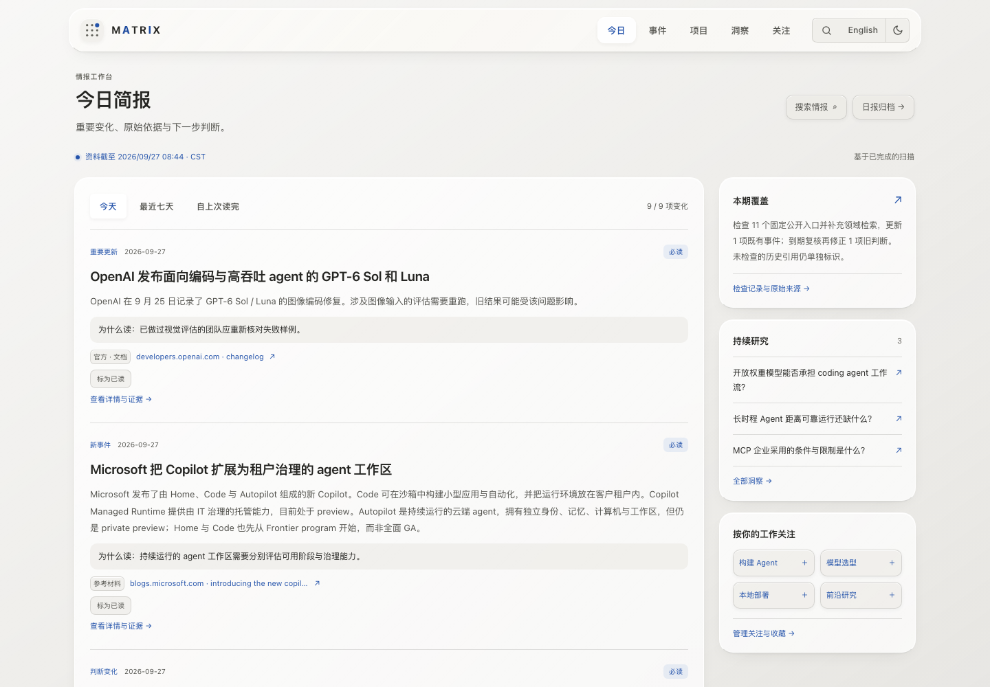
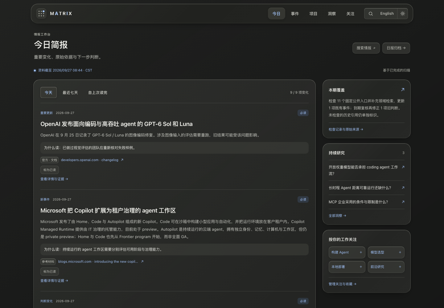
This document records the local implementation on 2026-09-27. The images below capture the current Chinese interface. Their content and as-of timestamps are snapshots, not claims of live information or deployment.
1. Final palette: warm white, silver gray, and graphite
The first iteration used blue-gray backgrounds and blue-purple glows. Feedback identified the deep blue as too reminiscent of a generic AI template, so the final direction removes those large color fields. Light mode uses warm white and silver gray; dark mode uses graphite and smoked glass. Blue provides limited interaction emphasis, while recommendation levels retain muted semantic colors.
| Token | Light | Dark | Purpose |
|---|---|---|---|
--bg | #eeedea | #191a19 | Page background |
--text | #252522 | #f0f0eb | Body text and headings |
--text-muted | #53534e | #cacbc4 | Secondary text |
--glass | rgba(255,255,255,.70) | rgba(40,41,38,.78) | Main panels |
--glass-heavy | rgba(250,249,246,.88) | rgba(34,35,32,.92) | Dense surfaces such as navigation |
--glass-inset | rgba(235,234,229,.62) | rgba(58,59,54,.66) | Inset controls and notes |
--accent | #2453aa | #a6c8ff | Links, focus, and selection |
The background retains only slight neutral light variation. Edge highlights, fine borders, translucency, and soft shadows establish glass without colored glows. Selection explanations also use neutral surfaces instead of repeated blue bars.
2. Three material layers across every page
| Layer | Components | Rule |
|---|---|---|
| Floating interface | Navigation and tools | Thicker glass preserves readability over scrolling content; clear selection |
| Content panels | Feed, projects, trends, sources, radar, articles, archives | Shared radii, edge highlights, and soft shadows; blur once per independent surface |
| Inset elements | Filters, buttons, labels, collapsed history, notes | Lighter inset surfaces; avoid stacking blur on nested content |
Glass throughout the site does not require a card around every paragraph. The update feed is one panel with fine separators. Detail pages distinguish the reading area from a narrow source rail while keeping facts close to their citations. New components share tokens instead of inventing page-specific tints and transparency levels.
3. A product interface comes from useful density and actions
- Direct headings. Use functional names such as Today's briefing, Projects, and Following rather than filling the first screen with slogans.
- Compact layouts. Desktop uses a feed plus research rail, or a reading column plus source rail. Mobile restores a clear single-column order.
- Reading first. Main workspace headings are about 28px, or 24px on mobile. Body text is generally 13-14px with generous reading line height. Current workspace headings use the system sans-serif stack.
- Visible controls, optional history. Time ranges and key actions stay available. Event and briefing calendars use the shared fold control so they do not consume the first screen.
- Archives are previews. Long titles wrap and use a line limit; Markdown links become readable preview text. Full citations stay on reading pages, avoiding nested links inside linked rows.
- Immediate feedback. Following, bookmarks, and read state have separate feedback. Buttons respond on press; continuous decorative animation does not compete with reading.
4. Interaction and accessibility share one specification
Folds reuse site/src/lib/detailsFold.ts: attachFoldAnim wires details elements; animateFold handles other containers. Expansion uses 260ms with cubic-bezier(0.2, 0.6, 0.2, 1); collapse uses 230ms with cubic-bezier(0.4, 0, 0.2, 1). Set inline height to zero before expanding to prevent a full-height flash. Programmatic changes from filtering apply immediately rather than replaying click animations.
With prefers-reduced-motion, states change immediately. Reduced-transparency and increased-contrast preferences, or browsers without backdrop-filter, use solid fallbacks. Body contrast targets WCAG AA. States use text as well as color; navigation, filtering, expansion, and following remain keyboard operable.
Mobile navigation retains all five destinations. Global search, language, and theme controls occupy the brand row. The event-specific search field sits below the five tabs, whose vertical position stays stable when changing pages. Essential information must not depend on hover. External links that open a new tab provide an accessible indication, and long URLs must not widen the viewport.
5. Implementation and reuse
| Source repository path | Responsibility |
|---|---|
site/src/styles/glass.css | Final materials, palette, component overrides, responsive rules, preference fallbacks |
site/src/layouts/Base.astro | Shared navigation, themes, and style entry point |
site/src/components/pages/Today.astro | Homepage workspace and research rail |
site/src/components/pages/EventsIndex.astro | Event filters and optional calendar |
site/src/components/pages/DailyIndex.astro | Briefing previews, calendar, and month groups |
site/src/lib/detailsFold.ts | Shared folding motion |
site/tests/browser/reading.spec.ts | Reading paths, themes, mobile navigation, and accessibility checks |
For a new interface, identify its hierarchy and actions before choosing a material. Do not start with oversized cards and then search for content to fill them. Token changes require reviewing body text, badges, buttons, and disabled states in both themes.
6. Verification and limits
Local verification included a 646-page build and 16 browser tests covering 360, 768, and 1440px layouts, both themes, bilingual navigation, and core reading paths. After the neutral palette change, automated accessibility checks ran again in both themes and homepage screenshots were inspected. Reduced-transparency behavior was also checked for disabled blur and solid backgrounds.
These checks support the current implementation; they are not certification across every device and assistive technology. Future components still require checking long titles and URLs, empty states, dense evidence, keyboard focus, and links under the GitHub Pages base path.
The palette and layout serve the reading goals in Product and Intelligence Design. This document preserves reusable principles; synchronizing it does not replace Derek Hub's own visual theme.